Beaches App
UX Design · UX Research
Refined and enhanced the user interface (UI) and user experience (UX) of the Beaches App main product
Summary
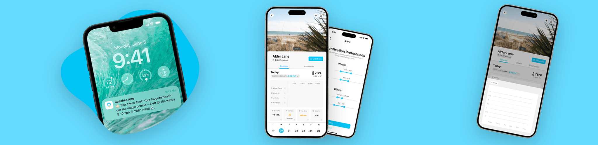
Onboarding
Subscription Screen
Beach Screen
Widgets
Project Context
Jan-May 2024
Team: 2 People
Tools Used
Figma
Photoshop
Onboarding
Low/Mid Fidelity

I revamped the onboarding process for the Beaches App during my internship, aiming to enhance user engagement and subscription rates. I analyzed and redesigned the registration process, simplifying it by reducing form fields and clarifying benefits. Through this, since about a month after launch, we were able to obtain around 200+ users registered with their email.
High Fidelity

Onboarding - Prototype
Free-trial screen
I spearheaded a crucial project during my internship: revamping the subscription interface for the Beaches App. This interface is pivotal for converting users to our premium service, Beaches+. The initial design lacked finesse, so I led a redesign to streamline the user journey from interest to commitment.

Inspired by a case study done in growth.design, the goal of these iterations were to address the customer’s fear of getting charged after the trial. In addition to presenting the product’s core premium feature, notifications based on beach conditions, I made sure to tackle the pain and fear of the user wasting money due to forgetting to cancel their subscription.
Problem Identification
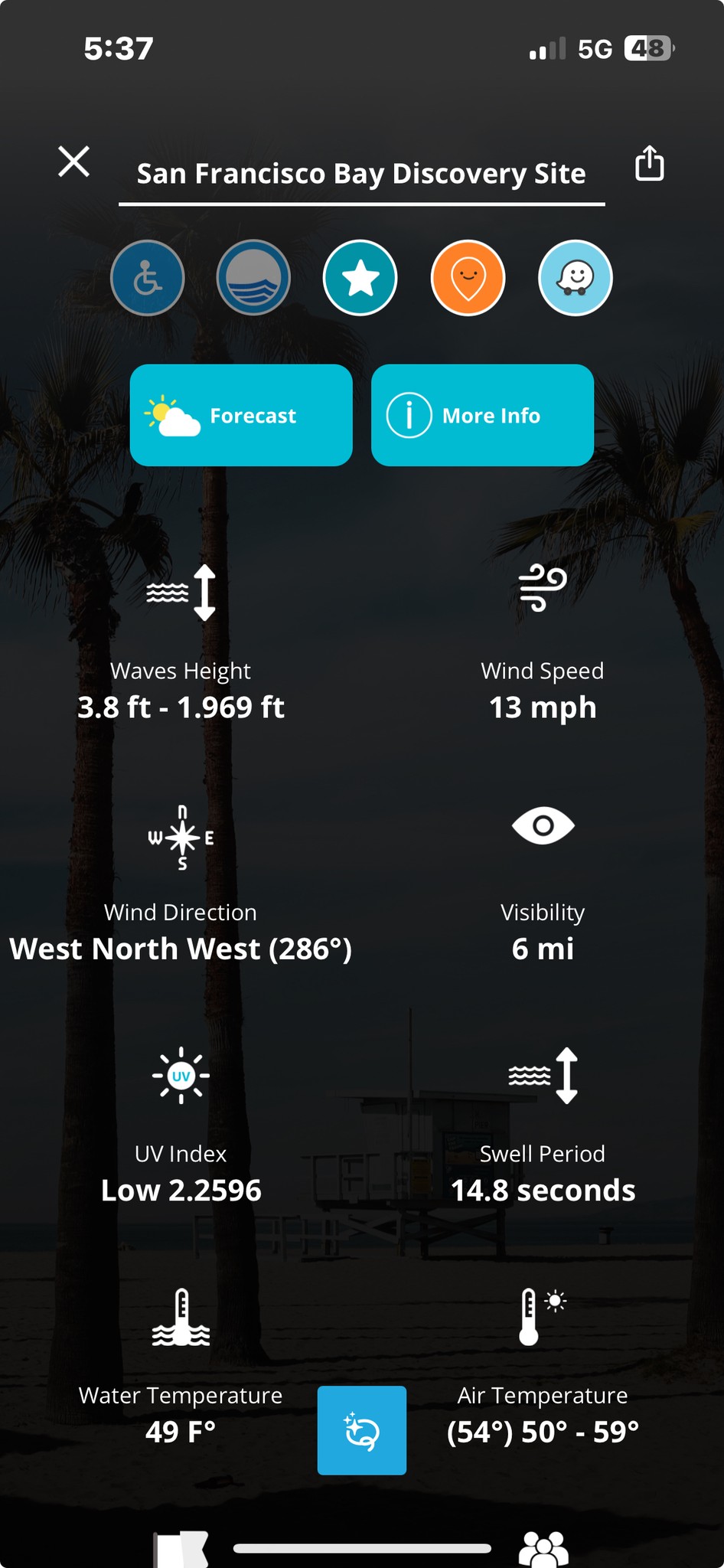
This was the initial beach screen UI. We identified that users were having issues with accessing valuable information such as amenities, pictures, and directions, which are all in the “More info” tab.
📝 User Research Results - Tourists/Travelers
Through user surveys, we identified that users who use the app mainly to tour and travel had the following likes and dislikes:
Likes:
• Filters for specific needs like disabled parking and volleyball.
• Comprehensive information on forecast, tides, and beach rules (prohibited and allowed activities, fees).
• Easy navigation with many filtering options.
• Extensive data on beaches including waves, tide, and temperature, and the ability to share beach information through messages.
• Finds beaches in new areas and displays crowd levels.
Dislikes:
• Confusion over how to use the AI function.
• AI is slow to load.
• The AI function is redundant in multiple places.
• No immediate images of beaches in search results or recommendations.
• Forecast display is overcrowded and difficult to read.
• No instant camera option like on some other apps (e.g., Surflline).
• Usability and Accessibility:
• Lack of a tutorial or instructions for using the app.
• Requires navigating to multiple sections to find detailed information rather than showing it immediately.
Areas of Confusion:
• Uncertainty about the function of AI in the main menu and its purpose.
• The meaning behind specific icons like the Moovit icon and another unexplained icon next to the disabled icon.
📝 User Research Results - Surfers
Also through user surveys, we identified what information surfers find valuable:
1. Weather and Surf Conditions:
• Wave Size and Frequency: Detailed information on wave height and interval, crucial for determining if the conditions are suitable for their skill level.
• Wind Conditions: Data on wind direction and speed to assess the wave quality and surfing conditions.
Water Temperature: Important for deciding wetsuit requirements.
2. Tide Information:
• High and Low Tides: Timing of tides since they significantly affect the break of the waves and the surfable areas on a beach.
3. Crowd Information:
• Live Beach Crowd Levels: Surfers often prefer less crowded conditions for more enjoyable and safer sessions.
• Expected Peak Times: Information about the busiest times at various surf spots to plan visits during less crowded hours.
4. Local Surf Community Feedback:
• User-Generated Content: Reviews and ratings from other surfers regarding beach conditions and surf quality.
• Discussion Boards: Access to local surf community insights and tips about hidden spots, hazards, and local etiquette.
5. Safety and Environmental Updates:
• Shark Activity and Safety Alerts: Notifications about recent shark sightings or other safety concerns.
• Water Quality Reports: Updates on pollution levels, red tide occurrences, and other environmental factors that affect water safety.
6. Accessibility and Amenities:
• Parking Availability: Real-time updates on parking situations, especially in high-demand surf spots.
• Facilities Information: Details about showers, restrooms, and food options near the surf spots.
User Personas

Brainstorming & Low-fidelity

🧠 Brainstorm #1: Controller similar to Apple Maps. The user can swipe the controller up to see more information about the beach, making it a lot more obvious for the user to utilize these features.

🧠 Brainstorm #2: This iteration consists of simple tabs which also does a good job of making the features more obvious.

🧠 Brainstorm #3: The last iteration puts everything into one page so that the user can’t miss the features.
Mid-fidelity

⭐ Iteration 1: In this iteration, I displayed images similar to the fleshed out version of brainstorm #2. I focused on displaying the forecast in a more intuitive way, with a chart that shows an overlay with a graph. The overlay also makes it easy to change which day to view. If the user clicks on a day you want to focus on, an overlay with more specifics about the day pops-up.

⭐ Iteration 2: This iteration displays the forecast in a list, with a chart for the current day’s conditions as it was in the initial design. Additionally, it has tabs for the different functions, which was explored in the brainstorm.
Fixing the Businesses Tab


Initial Version: Consists of a "Business Info" button and an overlay

🤔 Idea 1: A businesses tab that also has a map overlay

🤔 Idea 2: Overlay that has tabs which can showcase both a list and map of businesses nearby

🤔 Idea 3: Tab with a controller that showcases businesses nearby using both a list and map
Mid/High-fidelity

⭐ Iteration 1: This iteration includes widget-like boxes that show live information for the user in the "live" tab. The user can also check a circle for the condition they want to focus on, and it will be displayed in more detail in the "forecast" tab. The "forecast" tab shows the forecast for the day that the user selects, using the controller at the bottom of the screen. The details of the condition that the user selected will be displayed as graphs below the forecast. Finally, nearby businesses are shown as a list in the "businesses" tab.

⭐ Iteration 2: This iteration minimizes the number of tabs so that there is more space for future features. This layout also shows the current conditions of the given beach, and the user can once again select a condition that they'd like to focus on.

⭐ Iteration 3: This iteration focuses on a more intuitive way to display information using bigger widgets and icons. There was also a tab included for further details such as amenities and restrictions of. the given beach. The user can click on a condition to focus on and there will be an overlay that shows a graph for the clicked condition.