iOS Calendar Application Case Study
UX Design · UX Research · Prototyping
Redesigned the Apple iOS Calendar Application by investigating usability issues and gathering user feedback from App Store reviews.
Summary
• User Research: Utilized a comparison matrix and secondary user research
• Wireframing: Wireframed a solution from the identified problems
• UX Design and Prototype: Crafted an iteration of a solution
Project Context
• April 2023
• Personal Project
• Team: Individual
Tools Used
• Figma
• Photoshop
• Goodnotes
Comparison Matrix

Secondary User Research
🙎🏾♂️ “It’s difficult to view my month or week at a glance and see my general business status. Makes it twice as difficult to balance work and life if you can’t view what’s happening in an overview.”
🙎🏼♀️ “When I open my calendar, I want to see a quick view of my month. All you provide is a bunch of dots that tell me I might have something planned that day.”
🙎🏿♀️ “Once upon a time I was able to choose whether the default display was a month, week, or day and it would stay that way. I could tap on a day of the month and that day would open. Now when I tap on an empty date in preparation to enter an appointment the empty date doesn't show up.”
🙎🏻♂️ “All the separate calendars have a color to identify it. But when you're looking at the page that shows the entire month, there's only a dot (.) to indicate there is an entry for that date - that's it.”
🙎🏽♂️ “... add a monthly view that will show what the day's event is by looking at the monthly calendar instead of necessitating clicking on the event.”


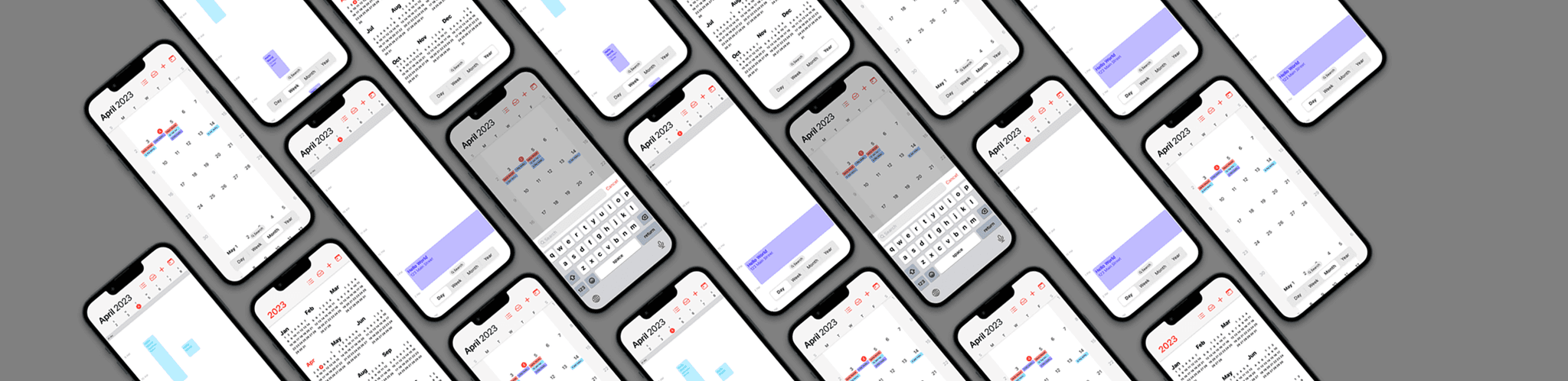
Addressing the current design challenges of the month view necessitates a thoughtful reimagining to enhance user experience and streamline navigation. The current representation of events as nondescript grey dots poses a hindrance to users seeking quick and easy identification.
Moreover, the convoluted navigation process between different views adds an additional layer of complexity, requiring users to resort to unconventional actions, such as rotating their entire phone.
To remedy these issues, a comprehensive wireframing approach was undertaken to introduce solutions that prioritize visual consistency and optimize both the month and week views of the calendar.
Wireframing

Icons & Colors

Visual Design & Prototype

Improved Month and Week view
Made switching views more obvious
The bottom bar focuses on viewing and locating events (changing views/search), which is usually the primary usage for a mobile calendar app, thus closer to the thumb.
On the other hand, the top bar focuses on modifying the calendar (accepting invitations, changing event colors, calendar titles, adding an event, etc.).
Reflection
This project aimed to improve the Apple Calendar iOS app based on user feedback. Key issues identified were difficulties in viewing events in the month view, navigating between different views, and inconsistencies in UI components.
The design process involved research, ideation, and prototyping. Wireframes were created to enhance the month view, introduce a weekly view, and establish visual consistency. Apple's design guidelines were followed for a cohesive experience.
Tools like Goodnotes, Photoshop, and Figma were utilized for wireframing, design iterations, and prototyping.
This project emphasizes user-centered design principles, addressing user needs, and enhancing UI/UX skills to improve the Apple Calendar app.